Ripe

Design system · v1.11 · light theme · WCAG 2.2 AA, AAA for critical elements

02 · Design system

Ripe design system

Tokens and components for a photo-first calorie calculator. Every value comes from tokens.json (W3C format). tokens.css is generated from it, and components.css uses nothing but those variables. Screens are 390×844, light theme, WCAG AA. Verified with npm run check.

268CSS variables
27components
AAAcritical text 7:1
44/48pt / dp targets

Read me firstAbbreviations

kcal
kilocalories: food energy
P
protein, in grams
F
fat, in grams
C
carbohydrates, in grams
g
grams
ml
millilitres
pt · dp
iOS points · Android density-independent pixels (1 pt ≈ 1 dp ≈ 1 CSS px here)
USDA
source of every nutrition value (FoodData Central)

FoundationsColour

Two layers. Primitives are the raw palette, and every family is named after a food. Semantic tokens say what a colour is for; components only use these. Each contrast ratio is measured on the background that colour is actually used on.

Primitives

White Only for text and icons on Persimmon. Never a background.
white#FFFFFFOnly for text and icons on Persimmon. Never a background.
Oat Warm neutral ramp: rice → oat milk → walnut → rye crust.
oat-0#FFFCF6Rice: cards, sheets
oat-50#FBF6EEOat milk: app background
oat-100#F4ECDFToasted oat: sunken areas, inputs
oat-200#E9DDCBOat flakes: dividers, disabled fills
oat-300#D6C6B0Bran: decorative borders
oat-400#B3A18AHusk: disabled text and icons (exempt from contrast)
oat-500#8C7A66Hazelnut: input borders (3.8:1)
oat-550#705F49Toasted walnut: disabled text (4.6:1, legible but clearly lighter than secondary)
oat-600#6B5A4AWalnut: secondary text
oat-700#4E4034Dark walnut: secondary text (7.2:1 on every light surface)
oat-900#2B2118Rye crust: primary text
Persimmon Brand ramp. Ripe fruit = appetite.
persimmon-50#FEF3EC
persimmon-100#FCE3CCApricot: tints, selected chips
persimmon-200#F9C9A6
persimmon-300#F4A06BPersimmon highlight
persimmon-500#E2552AFruit orange (illustration only)
persimmon-600#C4431APersimmon: brand, primary buttons
persimmon-700#9B3515Deep persimmon: primary button fill. White text 7.2:1 (was #A23614, 6.8:1)
persimmon-800#7C2A10Persimmon text: links, active tab, accent text (≥ 7:1 on light surfaces); pressed CTA fill
persimmon-900#5E200BPressed deep persimmon
Avocado
avocado-50#F2F6EB
avocado-100#E6EFD9Avocado tint: 'fits your day' tags
avocado-300#A9C47F
avocado-600#4A7326Avocado: freshness accent
avocado-700#3A5B1EText on avocado tint
avocado-800#36551CFresh text (7.2:1 on avocado tint)
Honey
honey-50#FDF3DFWarning tint
honey-100#FBE7B8
honey-400#F2B63DHoney: highlights, 'not sure' marker (fill only)
honey-700#9A6400Turmeric: warning text, over goal
honey-800#674300Warning text: 'check portion', over goal (7.1:1)
Basil
basil-50#EAF4EE
basil-600#2E7D4FBasil: success icons, high confidence
basil-700#24633ESuccess text on tint
basil-800#215A38Success text (7.2:1 on basil tint)
Chili
chili-50#FCECEA
chili-600#A8241CChili: errors (fills, icons, rings). White text 7.2:1 (was #B3261E, 6.5:1)
chili-700#8E1E18
Beetroot
beetroot-50#F8E9F0
beetroot-600#9B2F63Protein
beetroot-700#7C2550
Mustard
mustard-50#F8F0DA
mustard-600#A77A0BFat (graphics 3.6:1; use 700 for text)
mustard-700#86620A
mustard-800#674B08Fat text (7.1:1 on mustard tint)
Blueberry
blueberry-50#EAF0FA
blueberry-600#3B6CC0Carbs. The only blue: data marks only, never surfaces.
blueberry-700#2F5699
blueberry-800#2B4E8BCarbs text (7.2:1 on blueberry tint)
Alpha
alpha-rye-8#2B211814Rye at 8%: hover and pressed overlays
alpha-rye-12#2B21181FRye at 12%: hairline dividers
alpha-rye-40#2B211866Rye at 40%: scrim behind sheets

Background

Background colour tokens
SwatchTokenPoints toValueContrastUse
--color-bg-canvas--color-oat-50#FBF6EE—App background
--color-bg-surface--color-oat-0#FFFCF6—Cards, sheets, bars
--color-bg-sunken--color-oat-100#F4ECDF—Inputs, steppers, segmented track
--color-bg-disabled--color-oat-200#E9DDCB—
--color-bg-inverse--color-oat-900#2B211814.64:1 on canvasToasts, dark stickers
--color-bg-inverse-pressed--color-oat-700#4E4034—Pressed actions inside toasts
--color-bg-accent--color-persimmon-700#9B35157.04:1 on surfacePrimary buttons, scan button, badges with white text (white 7.2:1)
--color-bg-accent-pressed--color-persimmon-800#7C2A10—
--color-bg-accent-subtle--color-persimmon-100#FCE3CC—Selected chips, secondary buttons
--color-bg-accent-subtle-pressed--color-persimmon-200#F9C9A6—
--color-bg-fresh-subtle--color-avocado-100#E6EFD9—'Fits your day' tags
--color-bg-highlight--color-honey-400#F2B63D—'Not sure' marker
--color-bg-pressed--color-alpha-rye-8#2B211814—Overlay for pressed rows
--color-bg-scrim--color-alpha-rye-40#2B211866—

Text

Text colour tokens
SwatchTokenPoints toValueContrastUse
--color-text-primary--color-oat-900#2B211814.64:1 on canvasBody text and headings
--color-text-secondary--color-oat-700#4E40349.26:1 on canvasMeta, units, helper text, placeholders (≥ 7:1)
--color-text-disabled--color-oat-550#705F495.70:1 on canvasDisabled only: exempt from contrast, kept legible at ≥ 4.5:1
--color-text-inverse--color-oat-50#FBF6EE14.64:1 on inverseOn bg.inverse
--color-text-on-accent--color-white#FFFFFF7.21:1 on accentOn bg.accent
--color-text-accent--color-persimmon-800#7C2A108.89:1 on canvasLinks, text buttons, active tab (≥ 7:1)
--color-text-fresh--color-avocado-800#36551C7.16:1 on fresh-subtleOn bg.fresh-subtle (7.2:1)
--color-text-inverse-accent--color-persimmon-300#F4A06B7.56:1 on inverseActions on bg.inverse, e.g. 'Undo' in a toast
--color-text-inverse-success--color-avocado-300#A9C47F8.17:1 on inverseSuccess icons on bg.inverse
--color-text-inverse-warning--color-honey-400#F2B63D8.65:1 on inverseWarning icons on bg.inverse

Border

Border colour tokens
SwatchTokenPoints toValueContrastUse
--color-border-subtle--color-alpha-rye-12#2B21181F—Dividers (decorative)
--color-border-default--color-oat-200#E9DDCB1.31:1 on surfaceCard outlines (decorative)
--color-border-strong--color-oat-500#8C7A664.03:1 on surfaceInput borders: meets 3:1
--color-border-accent--color-persimmon-600#C4431A4.92:1 on surfaceSelected and focused inputs
--color-border-focus--color-oat-900#2B211815.38:1 on surfaceKeyboard focus ring (2 px + 2 px offset)
--color-border-error--color-chili-600#A8241C6.99:1 on surface
--color-border-inverse--color-oat-50#FBF6EE1.05:1 on surfaceLines on dark or camera surfaces: plate guide, shutter ring

Status

Status colour tokens
SwatchTokenPoints toValueContrastUse
--color-status-success--color-basil-600#2E7D4F4.93:1 on surface
--color-status-success-text--color-basil-800#215A387.23:1 on success-subtle
--color-status-success-subtle--color-basil-50#EAF4EE—
--color-status-warning--color-honey-700#9A64004.54:1 on warning-subtleWarning icons, over-goal ring (graphics ≥ 3:1). Use warning-text for text
--color-status-warning-text--color-honey-800#674300—Warning TEXT (7.1:1). status.warning is for icons and graphics only
--color-status-warning-subtle--color-honey-50#FDF3DF—
--color-status-error--color-chili-600#A8241C6.99:1 on surfaceReal errors only
--color-status-error-text--color-chili-700#8E1E187.80:1 on error-subtle
--color-status-error-subtle--color-chili-50#FCECEA—

Macros

Protein, fat and carbs. A magenta, gold and blue triad that stays separable under protanopia, deuteranopia and tritanopia (ΔE ≥ 29). Always shown with the letter P, F or C and a value.

Macros colour tokens
SwatchTokenPoints toValueContrastUse
--color-macro-protein--color-beetroot-600#9B2F636.88:1 on surface
--color-macro-protein-text--color-beetroot-700#7C25508.00:1 on protein-subtle
--color-macro-protein-subtle--color-beetroot-50#F8E9F0—
--color-macro-fat--color-mustard-600#A77A0B3.78:1 on surface
--color-macro-fat-text--color-mustard-800#674B087.14:1 on fat-subtle
--color-macro-fat-subtle--color-mustard-50#F8F0DA—
--color-macro-carbs--color-blueberry-600#3B6CC05.01:1 on surface
--color-macro-carbs-text--color-blueberry-800#2B4E8B7.15:1 on carbs-subtle
--color-macro-carbs-subtle--color-blueberry-50#EAF0FA—
--color-macro-track--color-persimmon-100#FCE3CC—Empty part of the calorie ring
--color-macro-kcal--color-persimmon-600#C4431A—Calorie ring value (brand persimmon, graphic ≥ 3:1 against the track)

FoundationsTypography

Three Google Fonts (SIL OFL). Young Serif is for headlines only (20 px and up). Hanken Grotesk is for all UI text. Azeret Mono is for every number, with tabular figures. Sizes are in rem, so they follow Dynamic Type; the pixel values are at the default text size.

--type-display
Point, snap, know.
Young Serif · 40/44 · 400
Hero numbers of the brand, onboarding
--type-h1
Today
Young Serif · 28/34 · 400
Large app-bar titles
--type-h2
We found 4 foods
Young Serif · 22/28 · 400
Sheet and card titles
--type-title
Oat & blueberry yogurt bowl
Hanken Grotesk · 18/27 · 600
Small app-bar titles, section titles
--type-body
Check the portion, then add it to Lunch.
Hanken Grotesk · 16/24 · 400
Default text
--type-body-strong
Salmon, cooked
Hanken Grotesk · 16/24 · 600
Food names in lists
--type-callout
Weigh the whole pot after cooking
Hanken Grotesk · 14/21 · 400
Secondary sentences, meta
--type-label
Final cooked weight
Hanken Grotesk · 14/21 · 600
Field labels, chips, buttons M
--type-caption
High confidence · per 100 g
Hanken Grotesk · 12/18 · 500
Minimum size (12). Confidence, helper text
--type-overline
Brand principles
Hanken Grotesk · 12/18 · 700
Section kickers (uppercase)
--type-num-xl
879
Azeret Mono · 44/48 · 500
kcal left on Home
--type-num-l
559 kcal
Azeret Mono · 28/32 · 500
Card totals
--type-num-m
150 g · 195 kcal
Azeret Mono · 16/24 · 500
Steppers, list kcal
--type-num-s
P 37 · F 23 · C 49
Azeret Mono · 13/20 · 500
Macro lines, per-100 g meta

FoundationsSpacing

A 4 pt grid (bars drawn at 4× scale). Use multiples of 8 for layout, and 4 or 12 only for fine steps. Screen side margin: --space-screen-margin (20).

--space-00px
--space-14px
--space-28px
--space-312px
--space-416px
--space-520px
--space-624px
--space-832px
--space-1040px
--space-1248px
--space-1664px
--space-screen-margin20px
--space-stack16px
--space-card-inset16px
--space-inline-icon4px
--space-chip-gap8px

FoundationsRadius & borders

xs6px
Badges
sm10px
Chips inside cards, thumbnails
md16px
Buttons, inputs, list rows
lg24px
Cards
xl32px
Bottom sheets
full999px

Border widths

hairline1px
default1.5px
Inputs, chips, steppers
focus2px
Focus ring thickness (WCAG 2.4.7 / 1.4.11)
rule3px
Heavy rule in the nutrition facts table
focus-gap2px
Gap between a control and its focus ring

FoundationsElevation

Warm, rye-tinted shadows, never grey. Most surfaces are flat; elevation marks things that float.

e1Cards and list groups
e2Floating buttons, toasts
e3Bottom sheets
accentScan button glow

FoundationsIcons & sizes

Drawn on a 24 px grid with a 2 px round stroke, coloured with currentColor. SVG files are in 01-branding/assets/icons/. Confidence icons are always paired with a word.

s · 16px
m · 20px
l · 24pxDefault: all icons are drawn on a 24 px grid
xl · 32px
today
diary
scan
recipes
profile
search
barcode
plus
minus
check
close
back
high
check-portion
unsure
fresh
viewfinder
portion
time
heart
calendar
alert
info
lock
flash
image
chev-r
signal
wifi
battery
breakfast
sun
snack
dinner
edit
trash
arrow-up
arrow-down
copy

Component sizes and safe areas

Component size tokens
TokenValueUse
--size-touch-min44pxMinimum hit region on iOS: 44×44 pt (Apple HIG, Buttons & Accessibility)
--size-touch-android48pxMinimum touch target on Android: 48×48 dp (Android accessibility guide, Material 3)
--size-app-bar-android64pxMaterial 3 small top app bar container height (64 dp)
--size-tab-bar-android64pxMaterial 3 navigation bar container height (64 dp)
--size-segment-android40pxSegment visual height on Android: 40 + 2×4 padding = 48 dp target
--size-button-l52px
--size-button-m44px
--size-input52px
--size-app-bar56pxTop app bar on iOS (content row below the status bar)
--size-tab-bar49pxTab bar content height on iOS, plus safe-bottom below it
--size-tab-indicator-width56pxPressed / active pill inside a tab (Material 3 active indicator 56×32)
--size-tab-indicator-height32px
--size-tab-label-max14pxTab labels stop growing at 14 px. Bar items don't scale with Dynamic Type; iOS shows the Large Content Viewer on long-press instead
--size-scan-button56px
--size-safe-top47pxStatus bar (iPhone 14/15)
--size-safe-bottom34pxHome indicator
--size-screen-width390px
--size-screen-height844px
--size-icon-stroke2pxEvery icon uses a 2 px rounded stroke
--size-chip36pxVisual height; the hit area is extended to 44 px
--size-thumb48pxProduct thumbnails
--size-segment36pxSegment visual height on iOS. Track padding (4) makes the hit region 44
--size-badge24px
--size-col-min5remMinimum width of equal columns (segments, macro columns, macro tiles). rem-based, so at large text sizes columns stack instead of clipping
--size-empty-icon72px
--size-shutter72pxCamera shutter button (larger than a normal target: the main action on the camera screen)
--size-plate-guide280pxPlate outline in the camera viewfinder
--size-recipe-thumb80pxImage size (1:1) in compact recipe cards. 80 leaves 226 px for the text column at 390 pt: the P / F / C row needs 200 px (225 with 3-digit values), so it stays one row
--size-icon-inset10px(touch-min 44 − icon 24) / 2: the space between a hit area and its glyph. Bars subtract it so the glyph, not the hit box, sits on the grid line
--size-macro-chip24pxCompact macro chip height (P / F / C). Three chips with 3-digit values fit one row in a 320 pt card
--size-step-number28pxRecipe step number disc
--size-measure40remMaximum width of reading text such as recipe steps: 40rem ≈ 75 characters of 16 px body text (WCAG 1.4.8: ≤ 80 characters). In rem, so it scales with text size
--size-day-ring32pxMini calorie ring around the date in the week strip (27). 7 days × 44 pt fit 308 pt; the ring leaves room for the date inside

FoundationsPlatform compliance

Every size checked against current Apple and Google documentation (sources in README.md). Android values apply inside data-platform="android".

Platform compliance: element, Ripe size, requirement, status
ElementRipeRequirementStatus
Hit region: every interactive element44×44 pt · 48×48 dpiOS ≥ 44×44 pt · Android ≥ 48×48 dpfixed (stepper ± was 41 pt, segments 36 pt)
UI icons24 px glyph on a 24 grid, 2 px stroke; 16 / 20 / 32 for badges, meta and empty statesMaterial 3: 24 dp · Apple: consistent size and stroke weightok
Tab bar icons24 px in a 44 pt (48 dp) tab; active icon gets a tinted fillM3 nav bar icon 24 dp, indicator 56×32 · HIG: prefer filled symbols in tab barsfixed (filled active state)
Tab bar height49 pt + 34 pt safe area · Android 64 dpM3 navigation bar container 64 dp · iOS system bar + home indicatorfixed (Android 64 dp added)
Top app bar56 pt, icons 24 in 44 pt buttons · Android 64 dpM3 small top app bar 64 dp, icon 24 dpfixed (Android 64 dp added)
Body / minimum text16 body · 12 caption minimum · rem-basediOS min 11 pt, default 17 pt · M3 body large 16 sp, body small 12 sp · support 200% textok
iOS app icon1024×1024, square, opaque PNG + SVG source1024×1024 square layers, no pre-masked corners, opaque backgroundfixed (opaque PNG exported)
Google Play icon512×512, 32-bit PNG, square, opaque512×512 32-bit PNG, sRGB, ≤ 1024 KB, full squarefixed (PNG exported)
Android adaptive icon108 dp layers, artwork ≈ 60 dp inside the 66 dp safe zoneLayers 108×108 dp; logo ≥ 48 dp and ≤ 66 dpfixed (logo was 39 dp)

Components24 components, every state

States are shown with .is-pressed, .is-disabled, .is-focus and .is-error. In the app they come from :active, :disabled, :focus-visible and aria-invalid. All numbers are real USDA values. Every state keeps its visuals inside its parent, and text is never clipped.

01

Buttons

.btn--primary · --secondary · --ghost · --destructive · .icon-btn
  • One primary button per screen. It does the main job, like "Add to Lunch".
  • Label = verb + object. Add the kcal total when it helps the user decide.
  • Heights: 52 (L) and 44 (M; 48 on Android). Icon buttons are 44×44 (48×48 on Android) around a 24 glyph.
  • Don't use destructive styling for "over goal". It's only for deleting data, and it always opens a confirm sheet that lists what will be deleted and offers 30 days to undo.
PrimaryDefault
PrimaryPressed
PrimaryFocus (2 px ring, 2 px gap)
PrimaryDisabled (nothing selected)
SecondaryDefault · pressed
GhostDefault · pressed
DestructiveOpens a confirm sheet (try it)
Size M · 44Primary · secondary · ghost disabled
Icon button · 44 ptSurface · tint · accent · pressed · focus · disabled
Android · 48 dpdata-platform="android"
02

Text field

.field · .field__control · .field__suffix · .field__help
  • Always a visible label. The placeholder is only an example.
  • Units live in the suffix (g, ml, kcal) and are set in Azeret Mono.
  • Errors say how to fix it, not just that something is wrong.
  • The border is an inset ring, so focus and error never change the size.
DefaultEmpty
FocusTyping
FilledWith result
ErrorOut of range
Sign-inNo memory or puzzle test
Disabled
03

Search bar

.search
  • Recent foods show first, before any typing (research insight 4).
  • Barcode lives inside the bar, so there's one place to find food.
  • No results → offer help: check spelling, add a custom food, or scan.
Default
FocusWith value and clear

No results. Did you mean Greek yogurt?

ErrorNo results
DisabledOffline
04

Chips

.chip · .is-selected · .chip--fresh · .chip--locked
  • For filters and quick choices, such as recipe filters and "Is it olive oil or teriyaki?".
  • Selected = apricot fill + persimmon ring + check icon, so it's not colour alone.
  • Visual height is 36; the hit region is extended to 44 (48 on Android).
  • Allergy filters are locked: a lock icon and the word "Allergy", never colour alone. They can only be changed in Profile, so a tap can't show unsafe recipes.
Default
Pressed
Selected
Focus
DisabledNo matches
Fits your dinner
FreshRecipe fits the kcal left
Peanut-free Allergy
LockedAllergy filter: not removable here, only in Profile
05

Segmented control

.segmented · .segmented__opt
  • Switches the unit for a portion: grams, millilitres or portions.
  • Disable options that don't apply (for example ml for rice) rather than hiding them.
  • Focus = 2 px surface gap + 2 px rye ring outside the segment. It fits exactly into the 4 px track padding and the 8 px gap between segments.
Unit
Defaultg selected
Unit, pressed
Pressedml
Unit, focus
FocusKeyboard on ml
Unit, disabled option
Disabled optionRice has no ml
Unit, Android
Android · 48 dpFocus on ml
06

Weight stepper

.stepper · .stepper__btn · .stepper__value
  • Tap ± for 10 g steps; tap the value to type an exact weight.
  • The kcal next to it updates live. This is how users fix photo estimates.
  • The border is an inset ring, so each ± button is a full 44×44 hit region.
195 kcal
DefaultWhite rice
208 kcal
Pressed+10 g
FocusTyping a value
At minimumMinus disabled
Enter at least 1 g
Error
DisabledItem removed
07

Product list item

.list · .product · .product--detected · .is-check · .product__thumb--icon
  • One canonical entry per food. The source (USDA) is named on the detail screen, not in the list.
  • kcal and P · F · C are per 100 g, rounded to whole grams in lists. Decimals appear on the detail screen.
  • Identical geometry in every state: rows are inset 4 px in the list, have a 16 px radius, and draw outlines as a 2 px inset ring. Dividers hide next to a highlighted row.
  • Search rows (.product--chips): the product photo (the same .product__thumb as the Meals rows: size-thumb, radius-sm, cover; alt="" beside the name) with the name to its right, top-aligned, wrapping, never clipped. Under the photo, from the card-inset line, the P / F / C chips (.product__macros), space-2 below the photo. kcal per 100 g and the Add button (44, "Add <food>", focus ring with a gap) sit on the right edge, centred on the whole row.
  • Settings rows (.product--nav, Profile): an icon tile, the name and its value, and a plain chevron button (44, named "Edit allergies"). Its glyph sits on the inset line, like every plain icon button at a row end.
  • Meal rows: a logged meal shows its dish photo. An empty meal shows a passive meal-type icon in the same 48 slot (not a button: no hit area, no states) and exactly one Add button on the right, so rows never shift.
  • Detected item (photo result): the photo marker number, the name, a confidence label, a weight stepper and kcal. Check portion tints the row so the user confirms the weight. A thumbnail is a real photo (<img class="product__thumb">) or, when there's none, an icon tile.
Avocado, raw
P 2 · F 15 · C 9
160per 100 g
Greek yogurt, 2%
P 10 · F 2 · C 4
73per 100 g
Salmon, cooked
P 22 · F 12 · C 0
206per 100 g
White rice, cooked
In this meal
130per 100 g
Broccoli, boiled
Tap to retry
—per 100 g
Default · Pressed · Selected · Disabled · ErrorSame row size in every state
1
Salmon, cooked
High confidence
288kcal
2
White rice, cooked
Check portion
195kcal
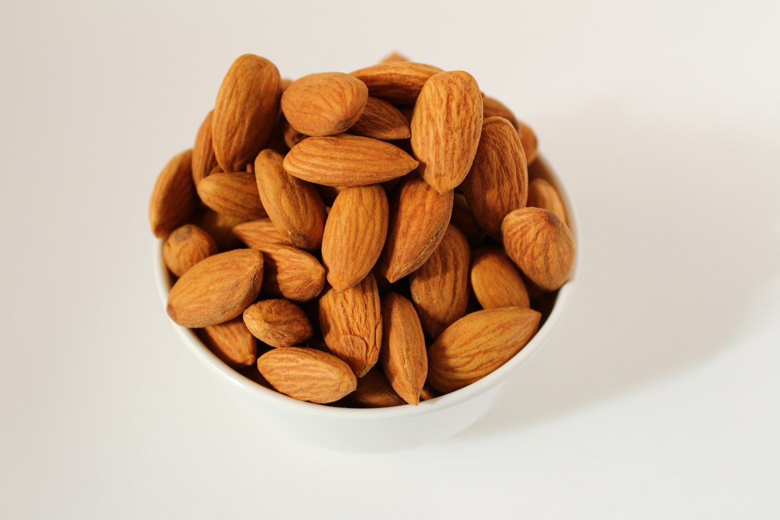
Almonds
P 21 · F 50 · C 22
579per 100 g
Almond butter
P 21 · F 56 · C 19
614per 100 g
Detected · Check portion · Photo thumb · Icon thumbPhoto result rows and search rows
Snack
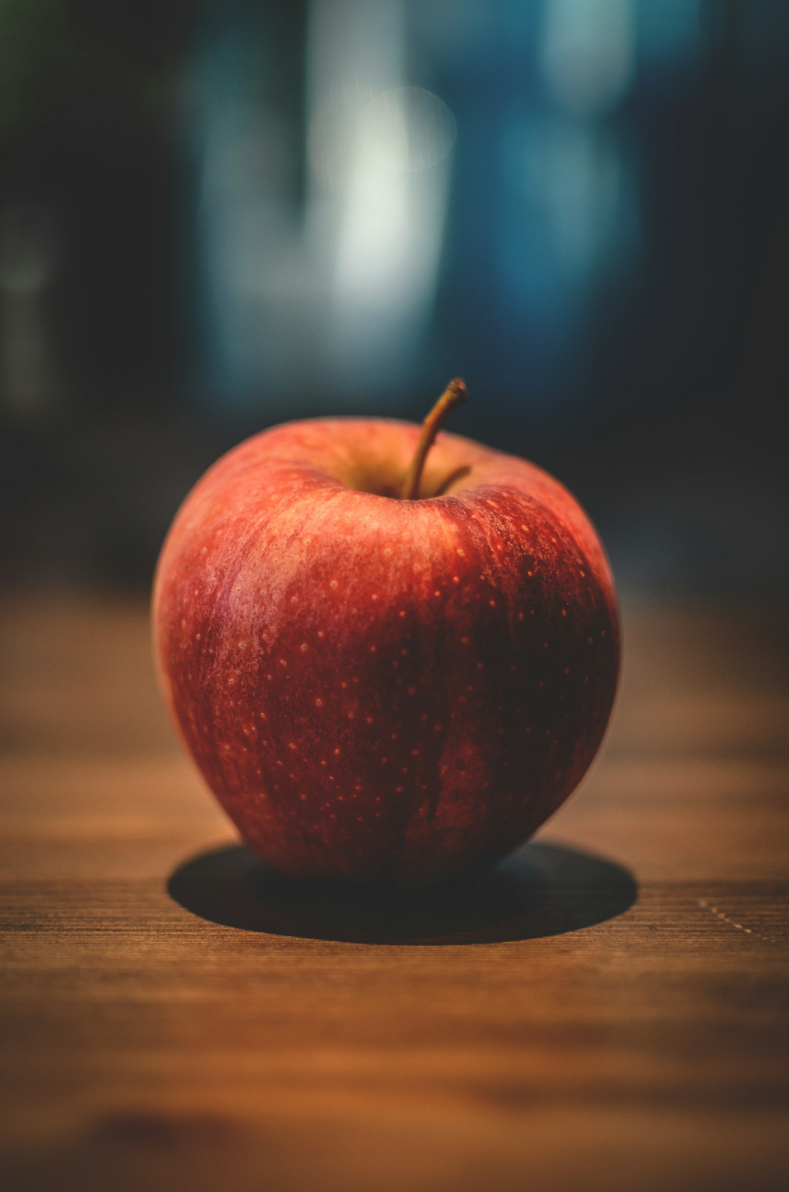
Apple, almonds
268kcal
Dinner
879 kcal left
Lunch
Nothing yet
Breakfast
Nothing yet
Snack
Logging closes at midnight
Meal rowsLogged: photo · Empty: passive meal icon + one Add button (default · pressed · focus · disabled)
Almonds
579per 100 g
Protein21 gFat50 gCarbs22 g
Roasted almonds
598per 100 g
Protein21 gFat53 gCarbs21 g
Apple
52per 100 g
Protein0 gFat0 gCarbs14 g
Greek yogurt
73per 100 g
Protein10 gFat2 gCarbs4 g
Search rowsPhoto + name · chips under the photo; kcal + Add centred on the right (Add: default · pressed · focus · disabled)
08

Recipe card

.recipe-card · .recipe-card--compact · .recipe-card__fit
  • Leads with "fits your …" when the recipe fits the kcal left (research insight 3).
  • kcal per portion is the biggest number; macros sit in the meta row.
  • No fixed height, no clipping. Long titles wrap and the card grows, including at 200% text size.
  • Macros are chips, the same macro-tile component as the detail screen: letter + value in the macro colours, no dot separators. Gap letter → value = --space-inline-icon (4, the clock → time gap); gap between chips = --space-chip-gap (8).
  • "View recipe" is a real button (secondary, 12.8:1, 44 tall) named "View recipe: <dish>"; Enter and Space open the dish.
  • Compact card for ranked lists: an image column --size-recipe-thumb (80) wide that runs from the top to the bottom padding of the card and grows with the text (grid align-items: stretch, object-fit cover, its own radius on all four corners; the card never clips) and one left-aligned text column (min-width: 0): title → time → reason → P / F / C → "Fits: 532 of 879 kcal" → kcal. Every row is --space-2 (8) apart; padding = --space-card-inset, image → text = --space-3. An optional "Best fit" badge sits above the title. The fit line is text, not colour alone.
  • Clickable image (.recipe-card__img--link): on the full card the image is a pointer shortcut to the recipe (pointer cursor, pressed overlay). It is aria-hidden and not focusable, so "View recipe" stays the single keyboard and screen-reader path.
Fits your breakfast

Oat & blueberry yogurt bowl

5 min3 ingredientsP 26 · F 7 · C 47
344 kcal
DefaultGreek yogurt 200 g + oats 40 g + blueberries 80 g
New

Pan-seared salmon with white rice, steamed broccoli and a light soy-ginger glaze

20 min4 ingredientsP 37 · F 23 · C 49
559 kcal
PressedLong title wraps
Offline

Roasted cauliflower, radish and broccoli tray with lemon-tahini dressing

Available when you're back online. We'll download it automatically.
412 kcal
DisabledNot downloaded, long title
Best fit

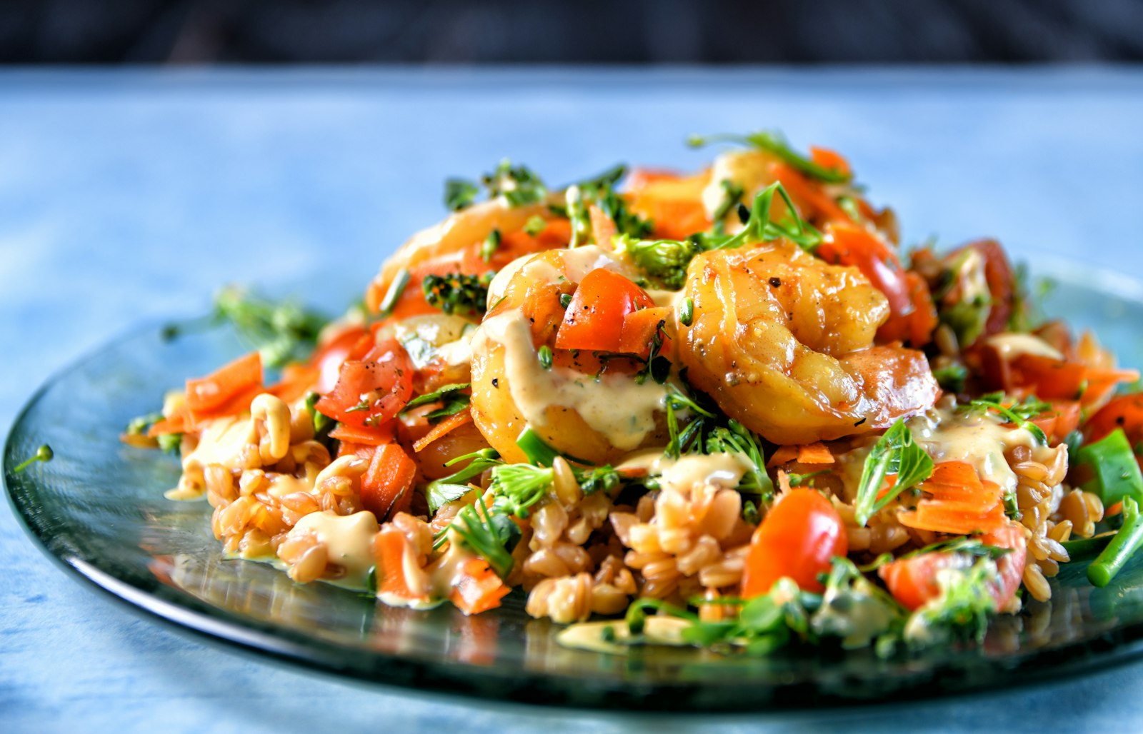
Shrimp & broccoli stir-fry with rice

20 min
Covers your protein
Protein46 gFat12 gCarbs63 g
Fits: 532 of 879 kcal532 kcal
CompactFull-height image, 80 wide · one text column: title → time → reason → P / F / C → Fits → kcal, 8 apart
View recipeDefault · pressed · focus · disabled (12.8:1, 44 tall)
09

Nutrition summary

.nutri · .nutri__ring · .macros · .macro--p/f/c
  • Leads with kcal left, not kcal eaten. It answers "can I have dinner?".
  • Macros are always ordered P → F → C, each with a letter, a value, a bar and the goal.
  • Over goal: the ring and number turn Turmeric, and the copy stays neutral.
  • Never red, never "warning", never an exclamation mark for going over.
879kcal left today
Eaten 1,171Goal 2,050
P · Protein
70 g
of 100 g
F · Fat
45 g
of 70 g
C · Carbs
127 g
of 255 g
On track1,171 of 2,050 kcal
120kcal over goal
Eaten 2,170Goal 2,050
P · Protein
118 g
of 100 g
F · Fat
76 g
of 70 g
C · Carbs
248 g
of 255 g
Over goalTurmeric, never red
Protein41 gFat12 gCarbs49 g

Baked cod, potatoes & broccoli · 1 portion

Macro chips.macro-tile--chip in .macro-tiles--inline
10

Nutrition facts table

.facts
  • Two columns: per 100 g and per portion, so users can compare foods and see their meal.
  • Energy row first, between heavy rules; sub-rows ("of which…") are indented.
  • The source is always shown under the title.

Salmon, cooked

✓ USDAAtlantic, farmed, dry heat · FoodData Central
Nutrition facts for salmon, cooked: per 100 grams and per 140 gram portion
NutrientPer 100 gPer 140 g
Energy206 kcal288 kcal
Protein22.1 g30.9 g
Fat12.4 g17.4 g
of which saturated2.5 g3.5 g
Carbohydrates0 g0 g
of which sugars0 g0 g
Fibre0 g0 g
Salt0.15 g0.21 g
DefaultPer 100 g + per portion
11

Top app bar

.app-bar · .app-bar--large · .is-scrolled
  • Sits below the 47 pt status bar. 56 pt on iOS, 64 dp on Android (Material 3).
  • Icons are 24 inside 44 pt (48 dp) buttons.
  • Titles wrap instead of truncating. When content scrolls under the bar, it switches to the surface colour with a hairline.

Add food

DefaultPushed screen

Salmon, cooked (Atlantic, farmed)

ScrolledBack pressed, long title wraps

Diary

LargeTop-level tab

Add food

Android · 64 dp48 dp buttons, focus
12

Tab bar

.tab-bar · .tab · .tab--scan
  • 5 items: Today · Diary · Scan · Recipes · Profile. Scan is a persimmon pill inside the bar.
  • Every indicator stays inside the bar: tabs are 44 pt tall with padding above and below, the pressed pill is inset 4 px, and the focus ring is inset.
  • Active = persimmon, bold label and filled icon, not colour alone. The 34 pt home-indicator area sits below.
DefaultToday active
Pressed · FocusToday focus, Diary + Scan pressed, Profile pressed + focus
Scan focusRing around the pill, inside the tab
Android · 64 dp48 dp tabs
13

Bottom sheet

.scrim · .sheet · .macro-tiles
  • For quick edits without leaving the screen, such as a portion or a meal choice.
  • Always has a handle and a close button. As a modal it traps focus, closes with Esc and returns focus to the control that opened it.
  • Macro tiles: three equal grid columns, the same padding, shared baselines and tabular numbers, all inside the sheet margins.

White rice, cooked

130 kcal per 100 g · ✓ USDA

Portion unit
195 kcal
P · Protein4.0 g
F · Fat0.4 g
C · Carbs42.3 g
Portion sheetPreview (non-modal)

Opens a modal <dialog>: focus moves in, Tab stays inside, Esc or ✕ closes it and focus returns to this button.

Modal behaviourKeyboard: Enter · Tab · Esc
14

Toast

.toast · --success · --warning · --error
  • Confirms an action and offers Undo. It stays until the user dismisses it or does something else: no timer, and a ✕ to close.
  • One line, plus an optional action. Shown above the tab bar.
  • The red error toast is only for real failures, such as no connection.
Added to Lunch · 559 kcal
SuccessWith Undo
It's a bit dark. Try near a window.
WarningAction pressed
ErrorAction focused (inset ring)
15

Empty state

.empty · .empty--error
  • Say what's missing and give the next step: one primary action and one alternative.
  • Friendly, never blaming. Photo failures always offer manual search.

Nothing for dinner yet

Snap your plate when you eat. You have 879 kcal left today.

EmptyNo dinner logged

We couldn't spot any food

Try again with the whole plate in frame and good light, or search for it.

ErrorPhoto not recognised
16

Badges and confidence

.badge · .confidence · .marker
  • Confidence = icon + word, on every detected food in a photo.
  • "Not sure" rows get a honey marker and a tint, and always offer alternatives.
  • Macro badges repeat the letter (P / F / C), so they're readable without colour.
✓ USDANewFits your day3
Status badgesVerified · new · fresh · count
P 37 gF 23 gC 49 g
Macro badgesSalmon plate totals
High confidenceCheck portionNot sure. Is it olive oil or teriyaki?
ConfidenceHigh · check · not sure
1234
Photo markersNumbered items · honey = not sure
17

Inline banner

.banner · .banner--offline
  • Explains a situation on the screen itself: offline, or why some results are hidden. Icon + text, an optional action.
  • Never auto-hides. It goes away when the situation changes (WCAG 2.2.3 / 2.2.4).
  • Don't use it for confirmations. Those are toasts with Undo.
InfoHidden by an allergy filter
OfflineToday, Diary
Offline + actionAdd food
18

Skeleton

.skeleton · --title · --short · --thumb · --block
  • Shows the shape of what's loading, so the layout doesn't jump. Cached data shows at once instead when there is any.
  • Screen readers hear "Loading…": the container has aria-busy="true" and a visually hidden label.
  • Reduced motion: the shimmer stops and the blocks stay static.
Loading search results…
ListSearch results
Loading recipes…
CardRecipes
19

Camera viewfinder

.viewfinder · .viewfinder__plate · .viewfinder__tip · .viewfinder__hint · .shutter · .icon-btn--inverse
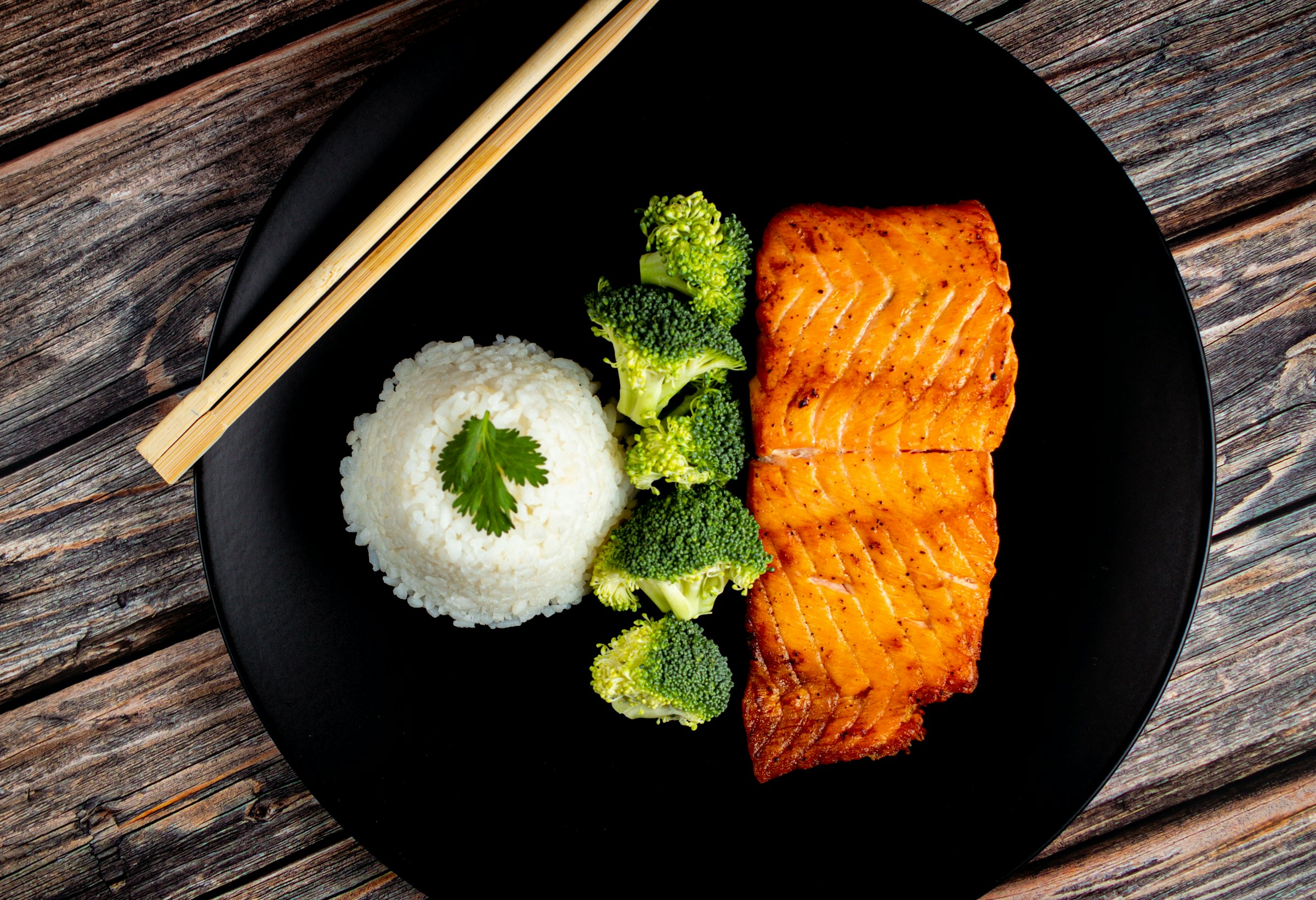
  • A plate guide, three tips and a live hint ("Plate found. Hold still"), matching the capture guidance in the brand brief.
  • Text never sits on the photo itself: tips are on solid dark pills and the hint is on a light pill, so contrast doesn't depend on the picture.
  • The shutter is 72, the main action. Library and Search are always next to it, so the camera is never the only way in.
  • Focus rings turn light on the dark camera surface.
Live camera view: a plate with salmon, rice and broccoli
  • Whole plate in frame
  • Good light
  • From above, about 45°
Plate found. Hold still
LivePlate found
Pressed · FocusShutter pressed, library focused (light ring)
20

Screen layout

.screen · .status-bar · .screen__body · .screen__foot · .screen__toast · .section-head · .card · .row-between · .photo
  • The 390 × 844 frame for every screen in 03-screens/: status bar (47), app bar, a scrolling body with 20 side margins, then a sticky footer or the tab bar (49 + 34).
  • The footer holds the one primary action, so it's always reachable and never covered by the keyboard or content.
  • Photo markers are positioned with data values (style="--x: 42%; --y: 55%"), with a light ring so they read on any photo.
  • The toast takes its own row above the tab bar (12 padding), so it never covers content, the primary button or a focused control (WCAG 2.4.11).
13:10

Lunch from a photo

Your photo: salmon, rice and broccoli on a dark plate1234

4 foods found

Check them, then add
Total559 kcal

Photo estimates can be off by 10–20%. Not medical advice.

FrameStatus bar · app bar · photo with markers · body · footer
13:09

Inverse status bar

Used over the camera. The default status bar is dark text on Oat milk.

Added to Lunch · 559 kcal
Toast rowAbove the tab bar, never over content
21

Date button

.date-btn
  • Calendar glyph + day + kcal left, under the Today title. The glyph starts on the screen-margin line, like every heading.
  • Icon and text are centred on one line; 44 tall with no side padding, so nothing shifts off the grid. Opens a date picker.
Default
Pressed
Focus2 px ring, 2 px gap
22

Title row and name editing

.title-row · .name-edit · .field__top · .field__count
  • Edit sits next to the name; its glyph ends on the right margin line, the hit area stays 44.
  • Inline edit: a labelled field ("Dish name"), a live character count, Save and Cancel. The h1 stays for screen readers while editing.
  • Errors say how to fix it: "Enter a name, for example …" and "Use 60 characters or fewer. It's 73 now." Long names wrap, never clip.

Baked cod, potatoes & broccoli

View
30 / 60

Up to 60 characters. Shown in Recipes and your diary.

EditFocus on the field
0 / 60

Enter a name, for example “Baked cod with broccoli”.

ErrorEmpty name
23 / 60

Up to 60 characters. Shown in Recipes and your diary.

SavingDisabled, aria-busy
23

Ingredient rows

.ingredients · .ingredient · .ingredient--edit · .ingredient__fields · .is-error
  • Looks like the Nutrition Facts card: the list sits inside a .facts card (title, source line, an uppercase header row on the heavy rule, hairline row rules, 14 px names, mono values right-aligned). The facts table and .ingredients--facts share the same CSS rules.
  • View is compact: the name on the left, the amount + unit right-aligned on one edge, two lines per ingredient: name | amount, then the P / F / C macro chips ("P 34 g", the same .macro-tile--chip component as everywhere) | "158 kcal". Amount and kcal end on one right edge (tabular mono, the facts value style); names and chips start on one x; 8 between the lines (--space-2). Rows are 8 apart vertically; text starts on the card-inset line.
  • Servings (.ingredients__servings): a label + the weight stepper (06, all its states) scales the ingredient amounts, row kcal and chips (1–8 portions; "−" disabled at 1, "+" at 8; typed values snap into range; the change is announced via role="status"). The dish summary and "Log 1 portion" stay per portion. In edit mode the row hides and amounts are edited per portion.
  • Edit: every value is a labelled field (Ingredient with suggestions, Amount, Unit g / ml / portion) plus a Delete button (44, inset focus ring). Totals, the calorie ring and macro bars recalculate as you type, announced via role="status".
  • Delete moves focus to the next row and shows an Undo toast (no timer). Leaving with changes asks "Discard changes?" with "Keep editing" first.

Ingredients

1 portion · ✓ USDA
Servings
  1. Cod fillet, baked150 g
    Protein34 gFat1 gCarbs0 g
    158 kcal
  2. Potatoes, new, boiled in their skin and crushed with extra-virgin olive oil and rosemary200 g
    Protein4 gFat0 gCarbs40 g
    174 kcal
  3. Olive oil10 ml
    Protein0 gFat9 gCarbs0 g
    80 kcal
View (Nutrition Facts look)Same card, header rule, row rules and fonts as the facts table
  1. 158 kcal · 150.0 g

  2. 80 kcal · 9.1 g (ml uses the food's density)

EditDefault · delete focused (inset ring)
  1. Pick a food from the list, for example “Broccoli, boiled”.

ErrorUnknown food, no amount
Garlic deleted
DeletedUndo toast, focus moved to the next row
24

Recipe steps (Method)

.recipe-steps · .recipe-step · .recipe-step--edit · .recipe-step__actions · .is-error
  • An ordered list (ol / li) after Ingredients. Each step: a number disc on the card-inset line and the text in one column (16 / 1.5, ≤ 80 characters, never justified). Long steps wrap.
  • Edit: a labelled field per step ("Step 2"), Move up / Move down / Delete buttons (44, named "Move step 2 up"). No dragging needed (WCAG 2.5.7); focus stays on the moved step. The first "up" and last "down" are disabled, not hidden.
  • Empty steps block Save with a hint. Deleting shows an Undo toast. A recipe without steps shows an empty state with "Add steps".
Total 30 minServes 2
  1. Step 1: Heat the oven to 200 °C (180 °C fan). Boil the potatoes in their skins for 15–20 minutes, until a knife slides in easily.

  2. Step 2: Bake the cod for 12–15 minutes, until it flakes easily, or 63 °C in the thickest part.

ViewMeta (clock + time, servings) above the steps
  1. One action per step. Include times and temperatures.

  2. Write what to do in this step, or delete it.

EditUp disabled · down focused · delete pressed · empty step error

No steps yet

Add how to cook this dish, one action per step, so you can make it again.

EmptyNever blank space
25

Step indicator

.progress · .progress__text · .progress__bar · .progress__seg · .is-done · .is-current
  • Onboarding progress on screens 02–06. The text "Step 2 of 5" is always shown; the bar only repeats it (aria-hidden), so progress is never dots or colour alone.
  • Segments: upcoming (track) · done and current (accent). --space-1 tall, --space-1 apart, full width of the content.
  • Not interactive: no pressed, focus or disabled state and no tab stop; going back is the app bar's Back button. No error state: progress can't be wrong.

Step 1 of 5

Step 1 of 5Current only

Step 3 of 5

Step 3 of 5Done · current · upcoming

Step 5 of 5

Step 5 of 5Last step
26

Option card

.option-group · .option-card · .option-card--check · .option-card__mark · .is-error
  • A native radio or checkbox inside a label: the whole card is the hit area (≥ 44 tall), arrows move between radios, Space toggles checkboxes. Grouped in a fieldset with a visible legend.
  • Title + description (body strong + callout, wraps, never clipped). The mark on the right is a ring (radio) or a rounded square (checkbox); when selected it fills and shows a check, so selection is never colour alone.
  • States: default · pressed · selected · focus (ring with a gap) · disabled · error (group). The error names the fix under the group.
Your goal
RadioSelected · pressed · focus · disabled
Reminders
CheckboxSelected · default
Activity

Choose how active you are to get a target.

ErrorNothing chosen
27

Week strip

.week · .week__day · .week__ring · .week__note · .is-over · .is-empty
  • Seven day buttons (Mon–Sun) in a group: the weekday, the date inside a mini calorie ring (--size-day-ring, 32) and a short note. One day is selected (aria-pressed="true"); today has aria-current="date" and the note "Today".
  • Every day button is ≥ 44 × 44. 7 × 44 = 308 pt doesn't fit the 280 pt content of a 320 pt screen, so there the strip uses up to 16 pt of each margin (14 at 320); targets never shrink. If even that doesn't fit, the days wrap.
  • Never colour alone: a day over the goal fills its ring in Turmeric and shows "+45" (its name says "45 over"). An empty day has a dashed track; days before sign-up and future days are disabled.
  • States: default · pressed · selected · focus · today · over · empty · disabled. No error state: days come from the phone; offline uses the inline banner (17).
This weekDefault · over · today + selected · upcoming (disabled)
StatesBefore sign-up · empty · pressed · focus · selected · over · default

ChecksAccessibility

AAEvery text colour, state colour and focus ring passes WCAG 2.2 AA. The table is in README.md, generated by tools/contrast.py.
Contrast
44 · 48Minimum hit region in pt (iOS) and dp (Android). Checked for every interactive element by npm run check.
Touch
200%Text scales with Dynamic Type and Android font size. Tested at 200% with no clipping.
Text size
0Serious or critical axe-core violations across the whole page.
axe-core

White rice, cooked

130 kcal per 100 g · ✓ USDA

Portion unit
195 kcal
P · Protein4.0 g
F · Fat0.4 g
C · Carbs42.3 g

Delete your account?

This deletes your diary, recipes and photos from Ripe. You have 30 days to change your mind: sign in again and everything comes back.